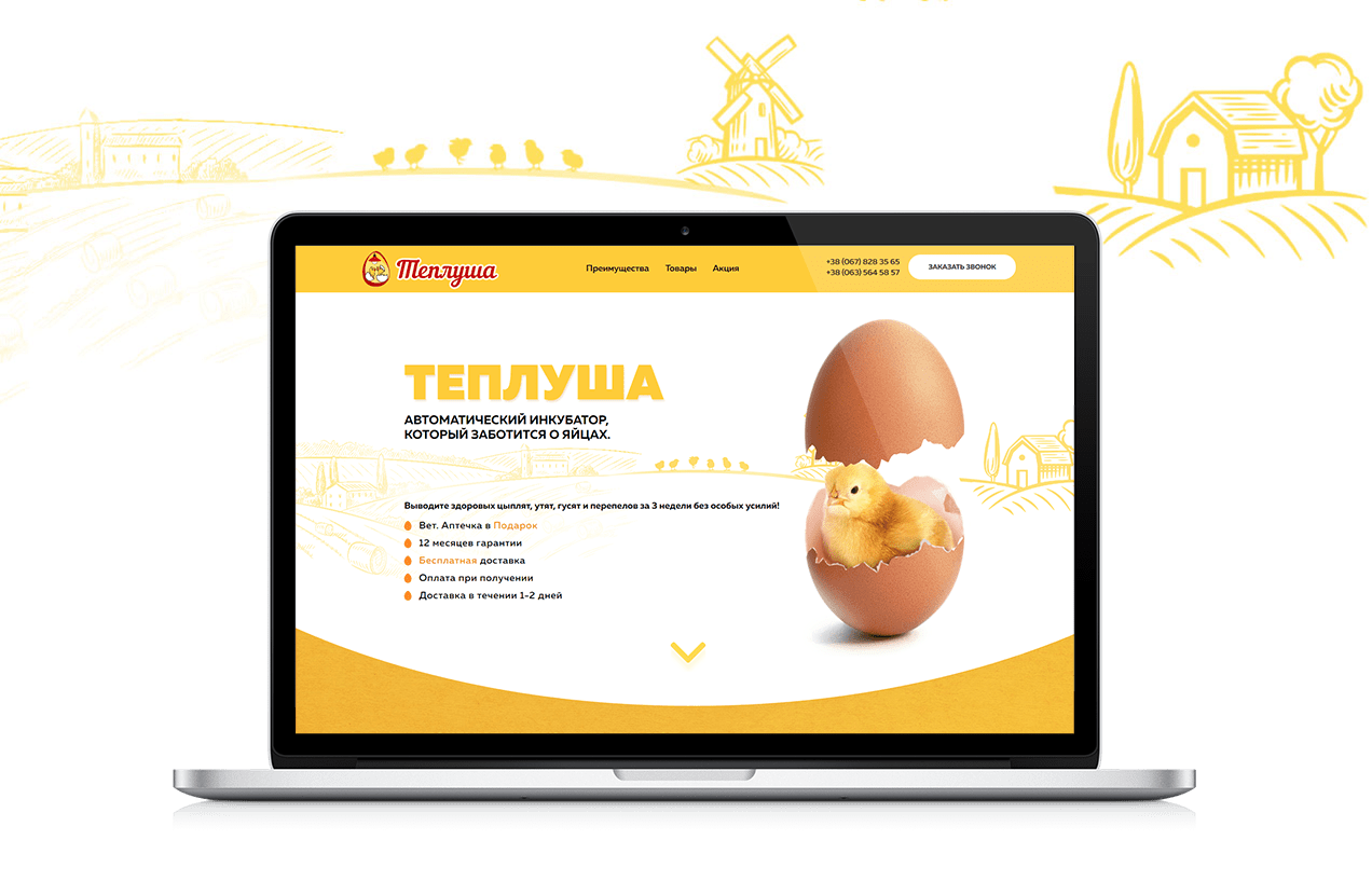
The website for Teplusha is represented by a selling page for automatic incubators. We used Landing Page technology, which allows to demonstrate all the advantages of the product and to generate the huge amount of leads. The website for Teplusha has a bright and memorable design, clear and well-structured information blocks, great usability and cuteness overload.
Even the judges of the national web design competition did not resist the shock dose of affection, warmth and fluffiness, so this work took 3rd honorable place there 🙂

START PAGE

MOBILE DEVICES LAYOUT

