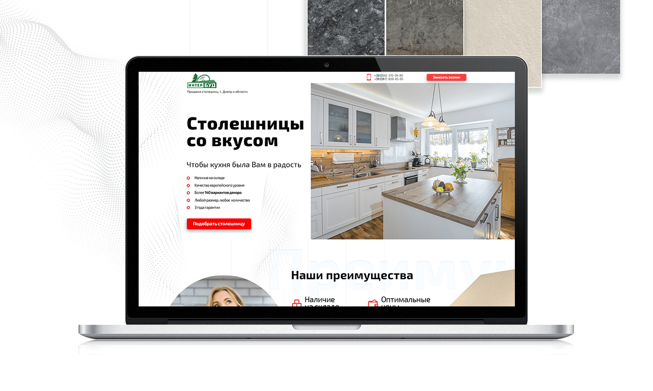
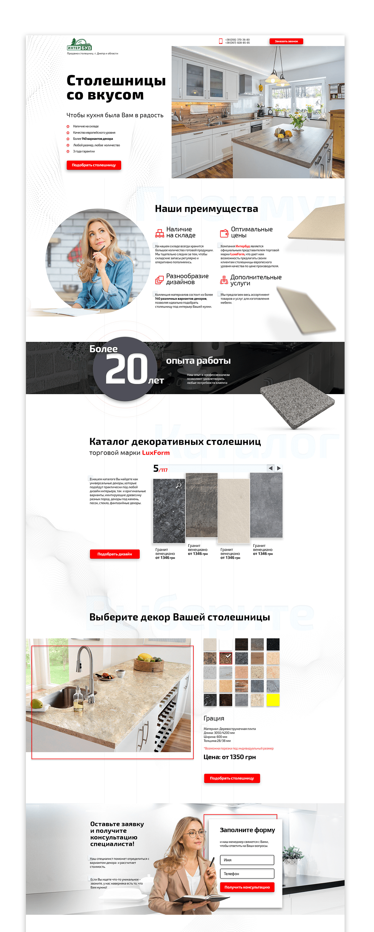
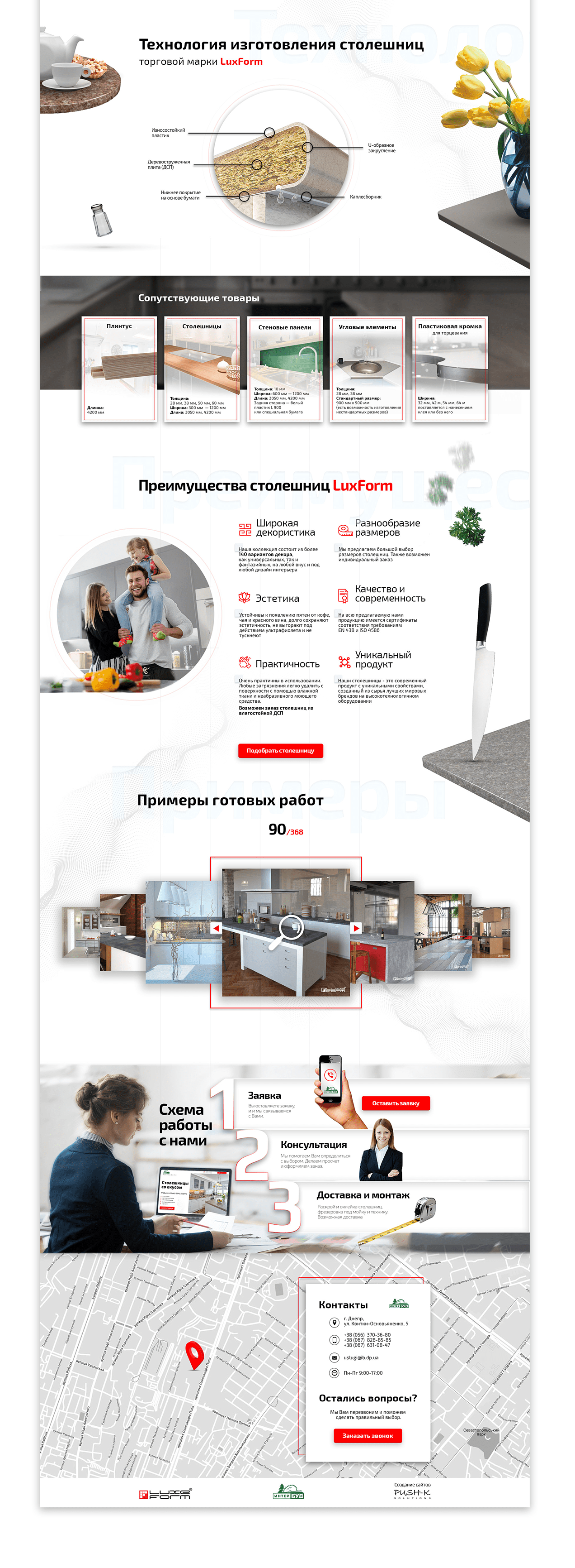
We got an interesting task – to develop a landing page for the sale of LuxForm worktops with a catalog of 140 different items of decorative materials. The catalog is implemented using the slider, on each slide of which there are 4 different positions with a name, article and price. The site visitors can choose material from the catalog or fill out an application to help them choose a worktop for the interior of the kitchen. You can also order related products here – wall panels, skirting boards, corner elements, plastic edge.
The site design, according to the customer’s wishes, is made in bright colors. The result was a very strict and restrained design that inspires confidence, creates the impression of stability and decency. Bright color accents are used only in buttons and infographics. Although there is a lot of content, it is presented in a logical sequence, where, block by block, the visitor receives all the necessary information to make a purchase decision. Visualization of worktop manufacturing technology allows you to clearly demonstrate the benefits of LuxForm worktops.
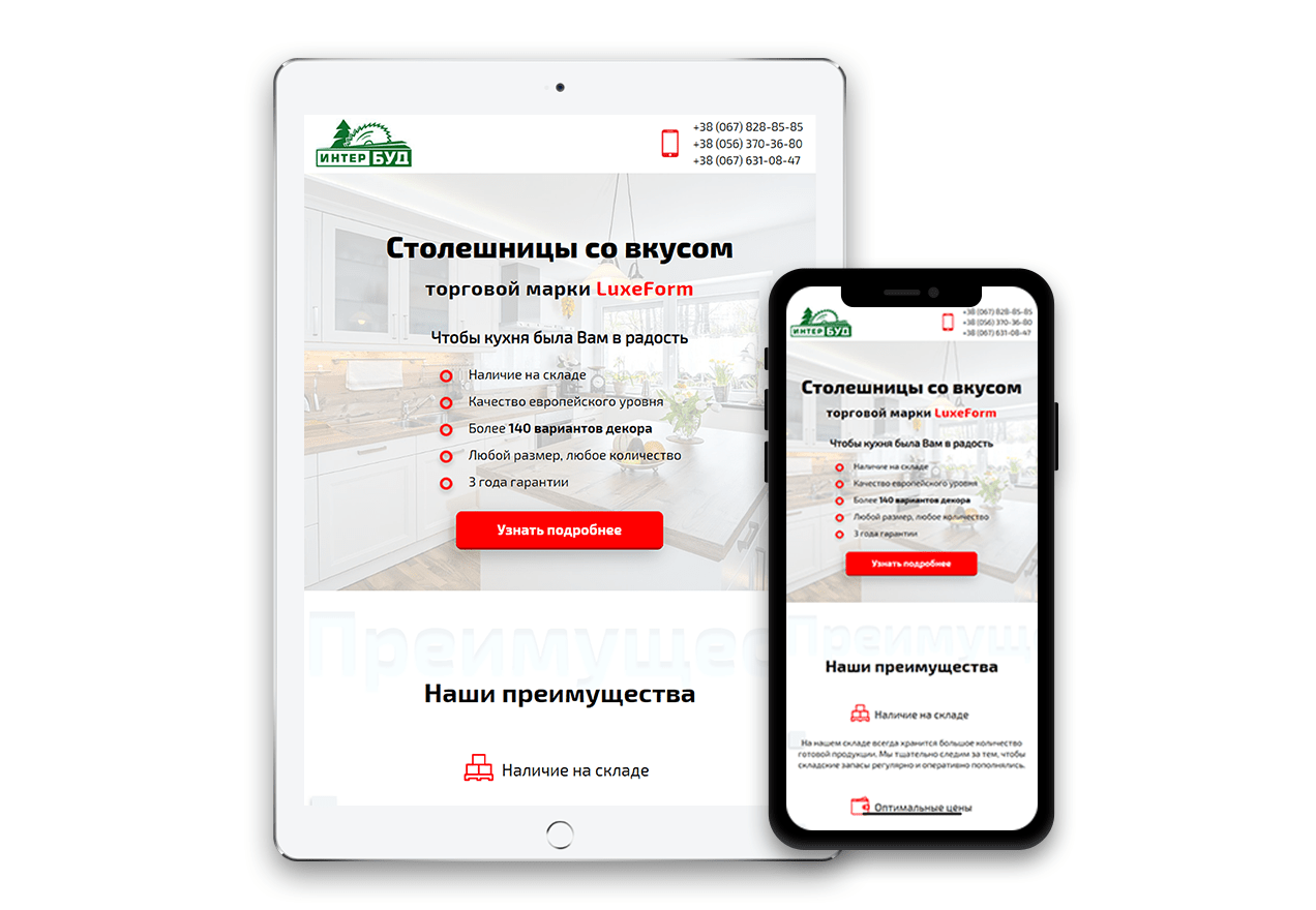
With this landing, we participated in the All-Ukrainian competition of sites, where, competing with complex multi-page sites, it received an honorable 3rd place in the category “furniture and interior”. After developing this site, we were convinced that a landing page with a catalog of 140 units can work quickly both on the desktop and mobile versions. If everything is done correctly, of course 😉
ADAPTIVE WEB DESIGN FOR MOBILE DEVICES
