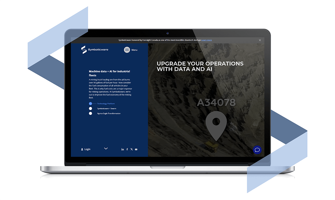
Our team has achieved new great web challenge and finished amazing corporate website for SYMX.AI (earlier Symboticware), international Soft&Hardware company headquartered in Sudbury (Canada). SYMX.AI offers performance management solutions for industrial fleets worldwide. The company’s products such as 4-Sight.ai and Squares provide monitoring, real-time reporting and actionable insights based on Machine data and AI for fleets in mining, forestry/logging, agriculture, construction and other industries.
When the client is R&D devoted the timing and budget frames for its new website development sometimes matters less than outstanding result. This web project is exactly that case. So, our team had the opportunity to experiment, research, develop and implement new cool web solutions. We didn`t waste this chance and did our best to present company and products powerfully at new corporate website. Some features we`ve described below.
The website`s main page contains haul truck 3D model. This 3D object appears on the second screen and accompanies the user`s journey up to fifth screen, playing different roles in the scenario of each section. To do this, the truck changes its projection, position and scale during scroll. That’s nice but we wanted more. At the 3rd screen (Predictive maintenance section), the same 3D truck loses its colored textures and turns into grayscale scheme with a single colored unit – the engine and the exhaust system. At the same time, the user can see this unit`s parameters and warnings (Air filter pressure, Engine speed, Off and Idle time). User can explore 3 more units` parameters in this section (Chassis, Payload, Operator Station). When switching to each subsequent unite, the list of parameters updates, 3D truck changes its projection and the selected unit becomes highlighted. It`s the way we demonstrate how SYMX.AI products work using 3D haul truck as example.

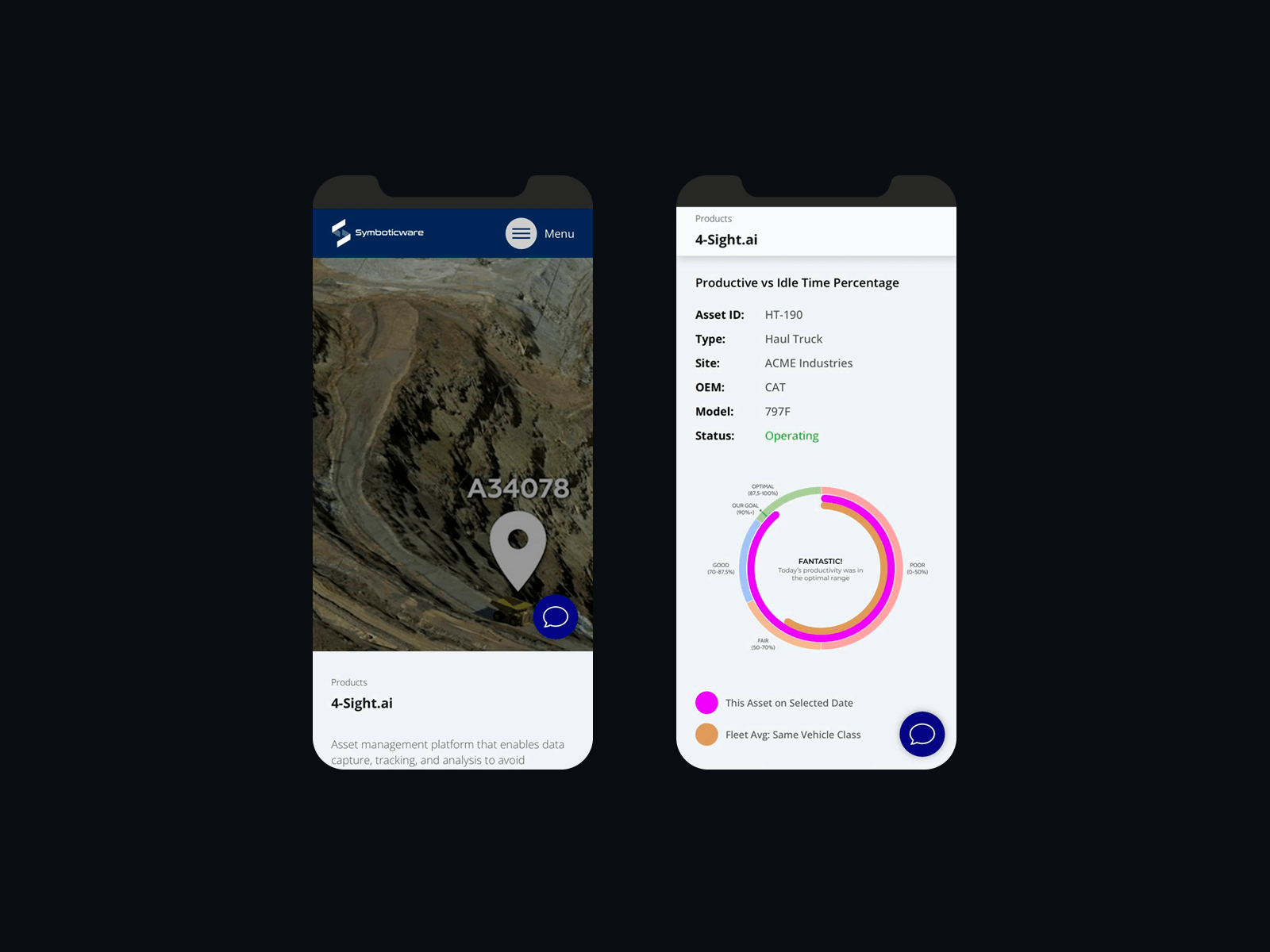
Every website`s page has added artistic value. Not a single detail has been missed. For example, when exploring the product pages (4-Sight.ai, Squares), the user sees pleasant animations that add ease to the content perception. The About us page contains amazing company’s history timeline starting in 2008. The years, descriptions and illustrations are tied to the page scroll, so it`s very pleasant interactive journey to discover company`s history. User can click on any year and the website will smoothly move him there.
This corporate website has combined an incredibly large amount of information content. Case descriptions, Customer stories, Expo events, Articles and News form a single content ecosystem. We`ve developed pages About, Team, HR and Contacts with office locations maps and section with Industries where the company’s products and solutions are in demand. For ease of navigation, in addition to a comfortable menu, a system of tags has been implemented for all information content pages. Desktop on-page navigation is improved with fixed left sidebar, which may contain additional functionality (breadcrumbs, titles, descriptions, tags, quotes, etc.) depending of page type.
To minimize the risks of our clients during the war in Ukraine, we have regulations for securing projects and the results at each website development stage. We express our gratitude to SYMX.AI team for trusting the Ukrainian web studio the developing of this important web-project, despite the war in our country. The PUSH-K Solutions team is ready for new challenges, we are moving further up!

CORPORATE WEBSITE`S MAIN PAGE

INTERNAL PAGES


DAPTIVE WEB DESIGN FOR MOBILE DEVICES AND BROWSERS

