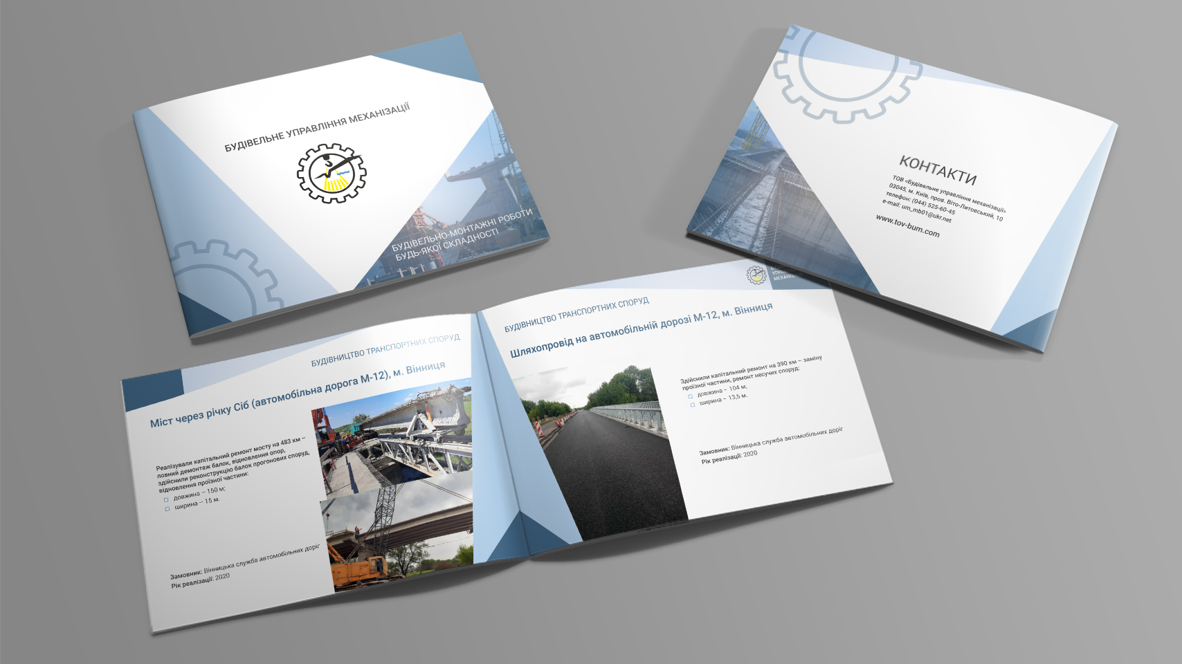
We`ve developed construction company catalog design. As is often happens, the only materials we`ve got to work with were just logo and some photos. As a result, we`ve created not only catalog, but also a corporate identity, which the client already uses in other communications.
The Construction Department of Mechanization catalog identity bases at conciseness and directness. Straight lines form simple geometric shapes and zone the space, giving it fullness. Cold colors create a feeling of practicality and technological approach. The company’s presentation, portfolio (technologically sophisticated industrial objects) and services descriptions are easily and well perceived when such corporate identity is used in design.
The project team (project manager, designer and copywriter) coped with the challenge quickly and efficiently – the client is satisfied, and his business has received a corporate identity.

