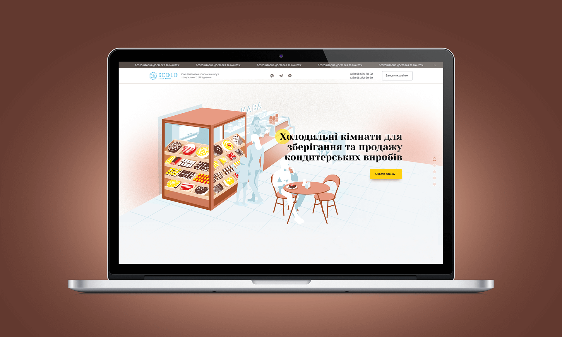
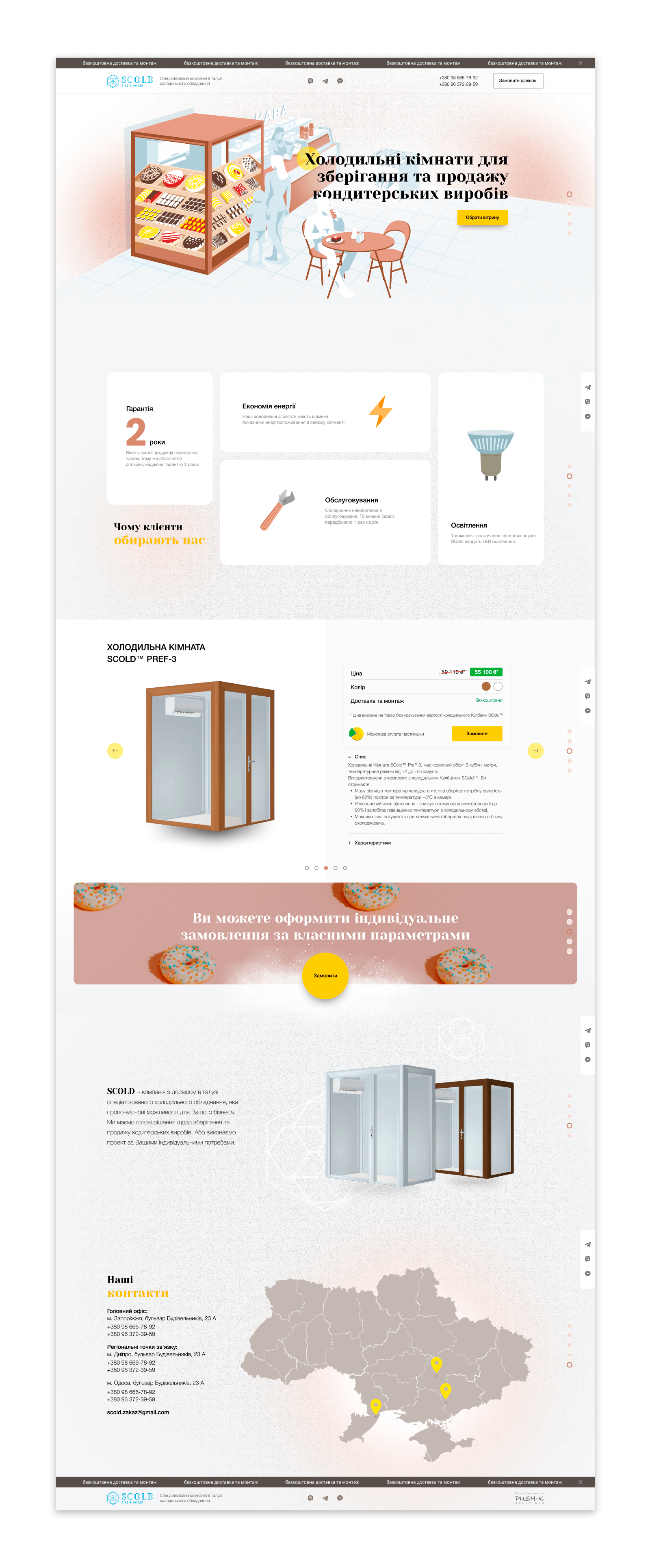
The landing page was developed for SCOLD refrigerating rooms for confectionery products which serves as showcases at point of sales. The target audience is units` managers of large retailers and confectionery companies, as well as small businesses of confectionery and bakery retail. B2B communication requires clarity, therefore, when developing this one-page website, we tried to tell about SCOLD cold rooms meaningfully with visual review.
After getting to website the user sees at once an amazing illustration of the shopping area, where cold room and confectionery products are highlighted with colors. If you look closely, you will notice that the illustration is animated (man drinks coffee, child points to sweets, seller makes latte). Light animation provides artwork with additional artistic value. Thus, we show the product in clear way just from start.
The light and sweet web design in combination with convenient functionality make it simple and pleasant to discover the products. Visitors can check the manufacturer’s advantages, types of cold rooms, their specifications, colors and prices. After researching the products, the user can send a request for a specific product or contact the manufacturer by phone, mail, or via Viber, Telegram, WhatsApp messengers.

LANDING PAGE WEB DESIGN

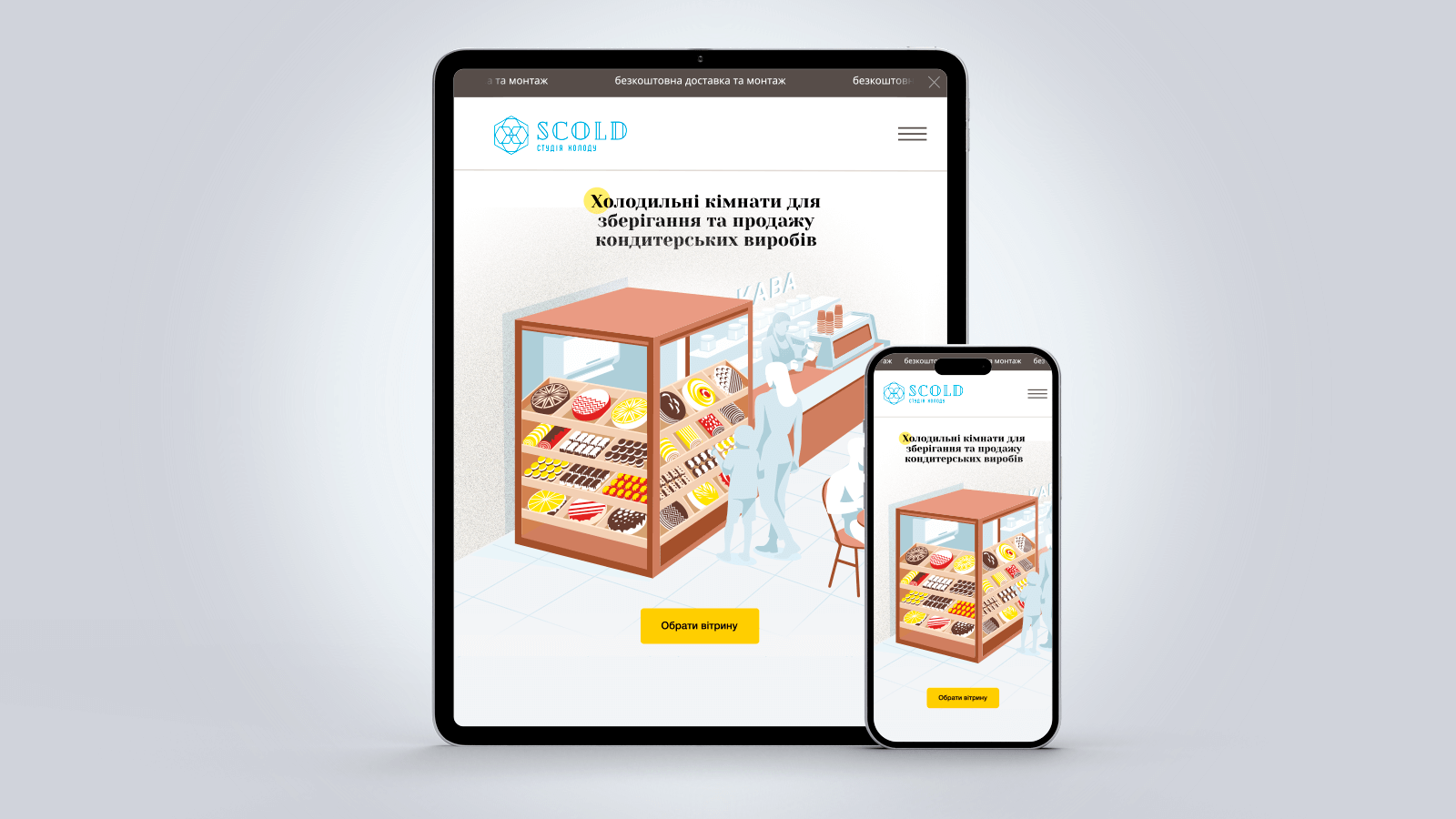
ADAPTIVE WEB DESIGN FOR MOBILE DEVICES AND BROWSERS

