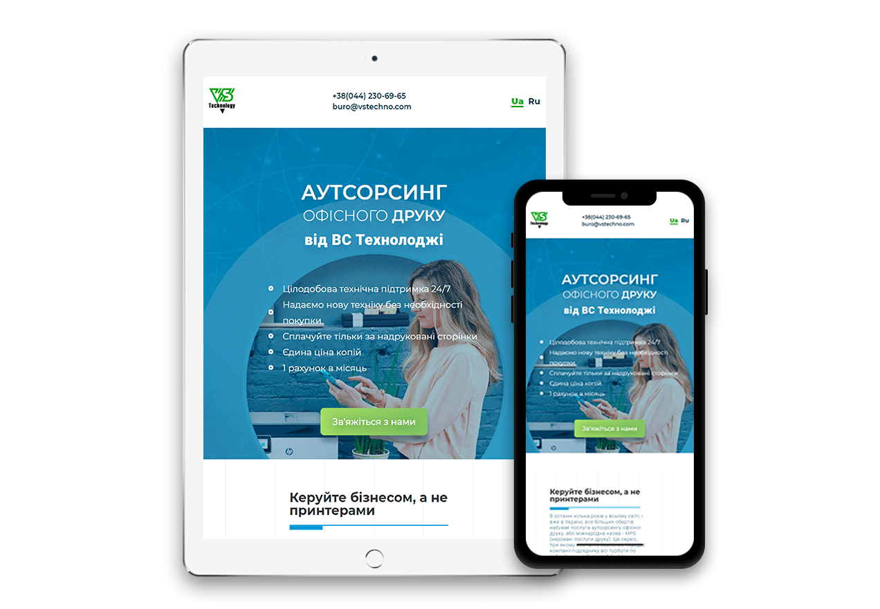
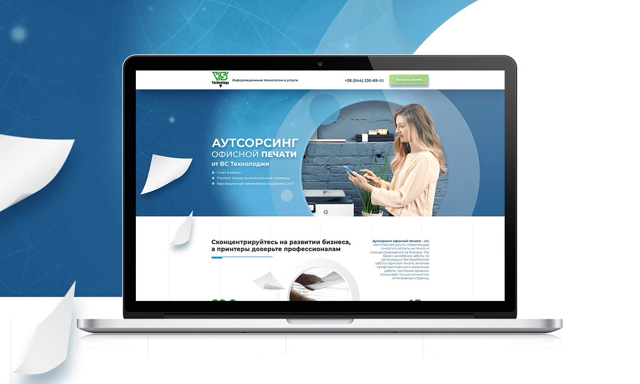
Landing development for VS Technology company, which is engaged in office printing outsourcing. The client received the task of developing a landing page that is very informative, rich in useful content, with the ability to convert visitors into customers using various forms of communication.
We tried to complete the client’s task by structuring a large amount of content, breaking it into separate blocks and presenting them in a logical sequence. As a result, the landing turned out to be informative, but at the same time, when viewing, there is no feeling of an excess of information. Visually, it looks bright, fresh, with good color accents. It turned out to dilute a rather official copyright with not boring details. The main potential customers pains were well developed, and on their basis the advantages of the company and the service itself were perfectly revealed.
Since the company VS Technology has a large number of branches throughout Ukraine, we decided to draw attention to this fact with the help of animation – the borders of the map of Ukraine on the site are drawn, forcing the user to turn their eyes to this block.
MAIN PAGE ADPTIVE LAYOUT OF LANDING

